Monday, August 31, 2015

NONAME: project thumbnails

We'll start here.
 This is not the beginning though. This project has been in development for a while and with the help and encouragement of several people is finally getting into what can be called prototype stage or proof of concept. The idea is to produce content that is entertaining and has embedded sponsor content, all that in the form of a comic, a digital comic. The details are more for those involved, this post (and the ones to follow) is more about the process of the prototype. First step thumbnails, YEAH!
Like I mentioned, this is not the beginning, but this is where things start to really take shape.
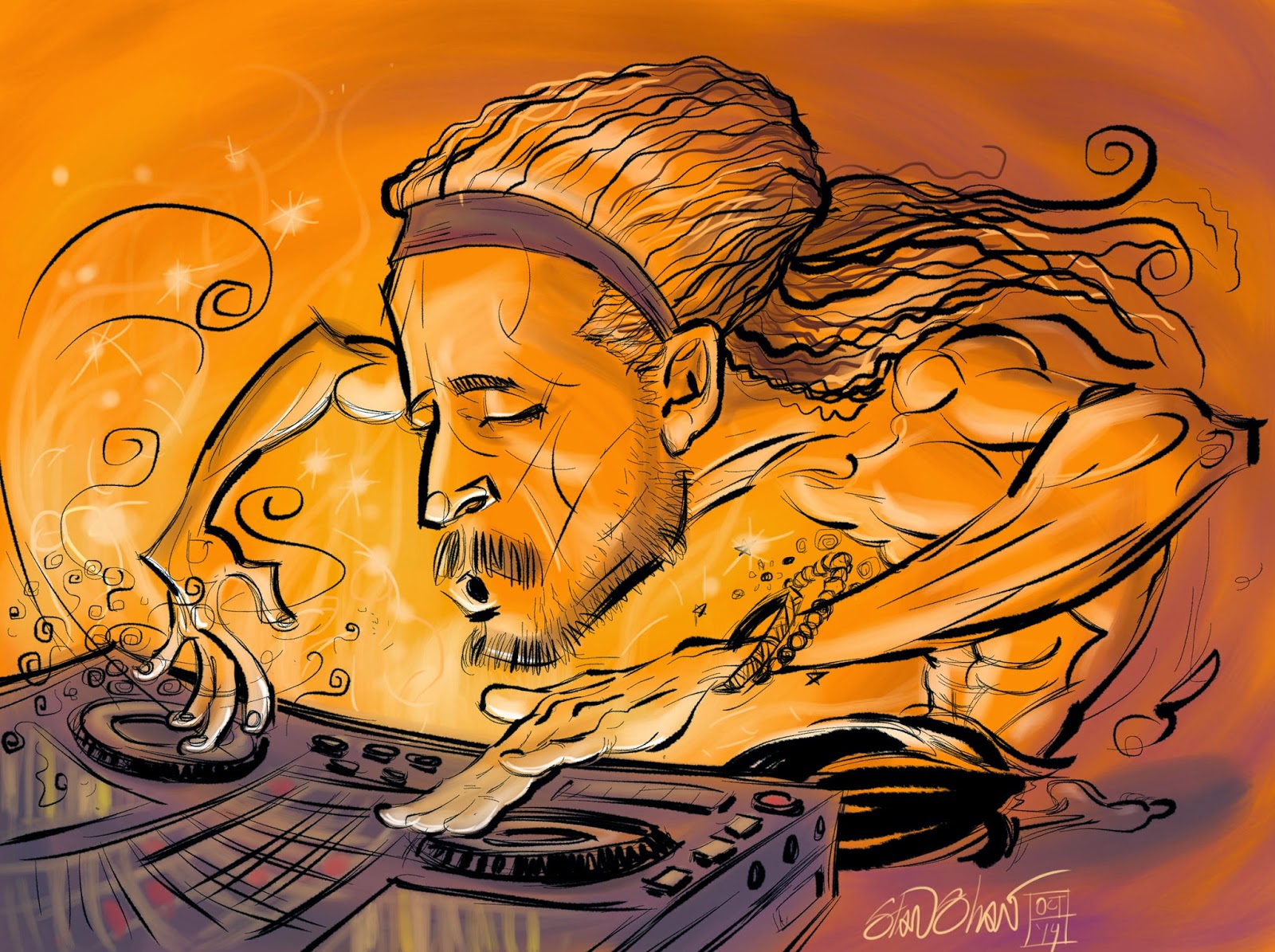
The format, functionality and story all meet and meld for the first time in these thumbnails. I have begun to put the story the writer and I developed together with the function that is crucial to the idea of the project. You can see story notes, tech notes side by side with the art. Dialogue is not done, and word balloons and narrative boxes are indicated in red.  They may not all be used but they show where text can be placed and what for. The thumbnails are now in the hands of  the writer who will flesh out the dialogue and script. Then I can tighten up the art, adding details like facial expressions. The blank panels are "black boxed" we know what has to happen and that there may be text there but the images are yet to come. There are a few thumbnails that I have used more finished art from a previous test stage.
So, these are getting scripted. While that's happening I'll be working on a specific usability issue and how to make it look the way it has been envisioned and not too intrusive. Also I'll begin (and finish!) a style test. So we can see just what this will look like when it's all done and polished! I'll post about that next, in a couple of days. Also the Final Final look for the main character, and perhaps a peek at the circular development he took! Stay tuned!

Monday, November 17, 2014

Camper Van Beethoven Reissue Comic

Hey music lovers! Camper Van Beethoven is using the comic, "That Gum You Like, (Is Back In Style)" in the reissue of their album, New Roman Times. The comic was originally done for No Depression Magazine's review of the album's initial release, so it's a real treat to see it picked up for the reissue. In the comic I followed and developed the narrative of the songs. A dystopian view of a near/alternate-future American West, with UFOs! Turns out the band liked it and obviously remembered it. All these years later I get a call for the record company asking to use the art! I made a few small changes and sent the pages off to the designer. The final product has yet to arrive, but it's nice to know when an illustration is well received, and ,"Back in Style."

Thursday, October 16, 2014

DJ Drez, drop dat beat!

This piece started out as a quick sketch I did at Wanderlust, a yoga festival in Whistler. I was fortunate enough to take a yoga class from MC Yogi, and DJ Drez provided the music! It was great fun! As I have with sketches of other celebs, I had DJ Drez sign it, and told him I would send him a copy of the finished illustration. I felt the sketch called for a high degree of finish. I had time at the festival, so I started the finished version on my iPad in Procreate. You can see the video here, http://youtu.be/EmHLpfyaaCY It was a while in between start and finish but I think it turned out well and does the subject justice. Procreate took some getting used to for the line work, but of all the apps I have tried on the iPad, it has one of the best inking tools and drawing feel.

Monday, October 13, 2014

Potential of Us

This is a animated version of the short I did for Verizon Wireless earlier this year. In this video I used the type which was not used in the final  piece. Put this together in AfterEffects, but the final is planned to be a digital book with narration and different type added. In the meanwhile there is this to enjoy!


Friday, October 03, 2014

Wedding Comicbook Cover

Every once in a while a things line up perfectly on an assignment. The right client, the right subject, the right style, the right amount of time and the right amount of dollars. Illustration is a business. This illustration fit all those slots. Just as I was finishing up a bunch of loose ends, I got an email asking if I would do a cover for Visit Seattle, The Official Destination Marketing Organization, that showed a Gay couple that has won a wedding package in Seattle. Part of that package is a comic book cover, since as it turns out they are both comic book fans.
Drawing the couple was fun. I got to return to a style that is easy and exciting for me. I had to focus a bit on the hands. I can still hear my mentor saying, " What's with the big papery hands!?"
The challenge was the background, yet another drawing of Seattle. It took a bit of discipline to stay dedicated to that. What helped was deciding to play around with shapes and highlights, to create that glowy Emerald City at night feeling.  You can see it when you're there but it's not easy to capture in a comic. But I'm happy with the results! As I hope the Groom and Groom are.

Cheers!

Tuesday, October 29, 2013

GeekWire Battle of the Bands Graphic


Ready, steady GO!…
One: Up down and straight. Order from chaos.
Two: Trying to remember what I learned from watching Ward Payne and Art Chantry work things out with lettering, while at the same time keeping it loose, with an Silver Age Marvel vibe.

Three: Now we see some things to move around…

Four: Pushing thru, being quick and fast. Hopefully fast enough to keep some of the energy and not fast enough to make a ton of mistakes.

Five: Ooops, Battle is spelled with two Ts!

Six: Vector pieces building the letters.

Seven: Add a few fun things at the request of the Marketing Director…

Eight: A few more fun elements for the designer to play around with and…done!


Thursday, October 10, 2013

Ruston Tunnel Playing Card: The Card went beep beep.

I picked The Ruston Tunnel because it was a fun place in Tacoma, a place you could sound your horn like crazy, because you were supposed too! Driving thru a tiny dark tunnel! What could be more fun? I wanted to make sure the card illustrations worked like playing card illustrations, that you could view/read them  from both sides. No top no bottom.  The Tunnel having two identical ends really lent itself to that. …"beep, beep"

My driving idea was a car, back lit, coming into the dark tunnel sounding it's horn. The light being the center and the words/sounds, "beep, beep",  readable both ways.  I tried adding oncoming headlights. A close runner up was to show both ends of  the tunnel with the road curving  from the dark into the light opening. I thought that was an intriguing idea but a little to gimmicky, forced, "beep, beep".

I went for simplicity in my next rough. Working digitally upsized. I had a lit tunnel entrance with the words readable both ways, "beep, beep(… the car went , beep, beep")
I felt this was on the right track, but somehow lacked the kind of mystery and fun of the tunnel.

I continued on, playing with the tunnel, the light and the words, "beep, beep". Maybe more of a straight ahead signage feel? Naaah. "beep, beep"
This last rough had some of the feel I wanted, the car, backlit with headlights on coming into the dark.

In the end I decided to strip everything away, giving up what I thought would be fun stuff to draw. I think it was Alex Toth that said something about reducing elements to just what is needed to tell the story, then drawing the hell out what is left.

Originally the words were set as type, but they didn't fit with the drawn headlights. So the set type was drawn, then flipped and rotated to make the card work like a card. Both ways, coming and going thru the tunnel…"beep, beep".

Full Color Storyboards: Built for Speed


It's been a few years since this project was completed. A chunk of the frames were lost,  the team has all moved on. Now's a good time to let these surface into the light.

Working fast can have it's advantages. It's great practice and a good way to get familiar with streamlining work-flow and working methods. It frees you from getting bogged down with application tricks and techniques, forcing you to rely solely on basic illustration skills.


These images are part of a project I worked on in December. All secret and copyright protected, so forgive the lack of details, but, there were over 30 images total. Backgrounds and characters were done separately. I was able to devote attention to each. Most anyone who's done backgrounds will tell you its best to think of them as characters. What you put into the backgrounds, how you light, draw and color them, defines their personality. I've found that a well considered background helps define the other characters in the scene. Sort of like saying where they come from.


When it gets to the characters you can really go, they have a rich setting to react to, crammed, stinky cabin, hot dry desert, calm blue stratosphere. And if you've developed the characters fully from the start it's that much easier and fun.


 Technically speaking there were all done this-a-way…
I did a rough breakdown for all 30 plus images in InDesign. Set up a page format containing the frame outline and written notes/script. Then drew the rough concept with the pencil tool. This way I could easily rearrange the frames and add or remove frames and notes. Once that document was approved, each frame pasted into Sketchbook Pro and did a detailed rough for client approval. Finished line art was done in Sketch book Pro and I spit me out a psd file to color in Photoshop.


In P-Shop I set up two brushes, with opacity overrides in the toolbar, and one eraser. I worked with as few layers as possible for speed.  I remember a friend saying, " layers are for pussies." I had a separate layer acting as a palette, so I could use  the eye dropper (accessible by quick key) to swiftly change color. It also allowed me to see how the colors would look in the composition which was useful.


I had a plug-in I installed that allowed me to email directly from P-Shop. So I did that for quickly sending art to client for approval. This again was all part of my putting in place every step of  the way things that smoothed out the work-flow without compromising the quality…too much…hopefully.  In the end the client was happy and I was happy with the look of the art.